This article was published as a part of the Data Science Blogathon.
The Covid-19 Pandemic is the greatest humanitarian crisis we’ve faced since World War 2. It is the most defining Global health crisis of our time. The virus has spread quickly and widely. The number of cases is rising daily as the government work to slow its spread.
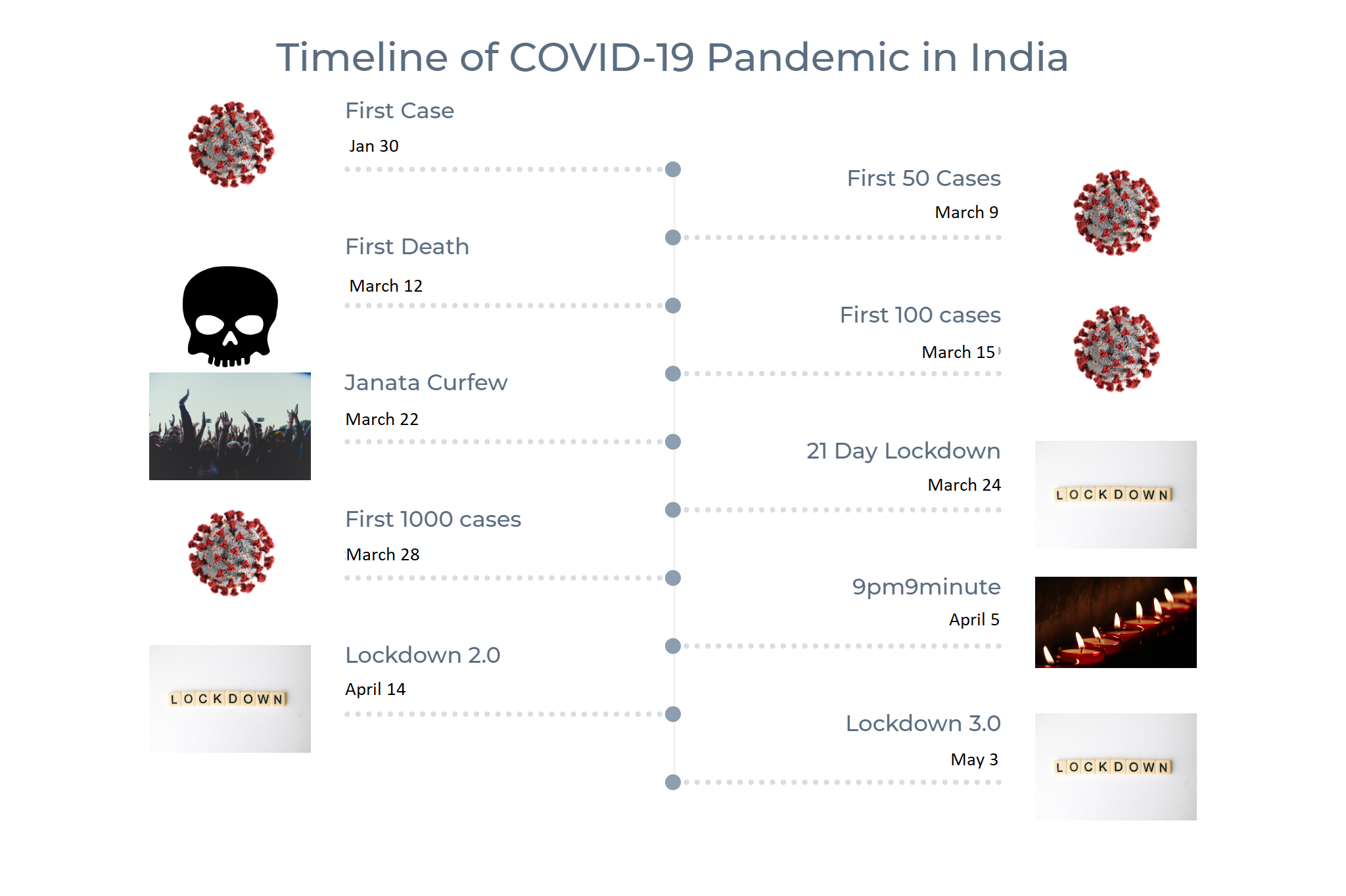
Today we will perform EDA and Data Visualization on the dataset called COVID-19 in India. You can find it in Kaagle here. Some further data sources are also included which are included in the data reading section.
Note: All the data used and inference drawn in this article is about last year’s, 1st wave of coronavirus India, so the results might be outdated. Let’s get started.
import pandas as pd
import numpy as np
import datetime
import requests
import warnings
import matplotlib.pyplot as plt
import matplotlib
import matplotlib.dates as mdates
import seaborn as sns
import squarify
import plotly.offline as py
import plotly_express as px
from IPython.display import Image
warnings.filterwarnings('ignore')
%matplotlib inline
age_details = pd.read_csv('../input/covid19-in-india/AgeGroupDetails.csv')
india_covid_19 = pd.read_csv('../input/covid19-in-india/covid_19_india.csv')
hospital_beds = pd.read_csv('../input/covid19-in-india/HospitalBedsIndia.csv')
individual_details = pd.read_csv('../input/covid19-in-india/IndividualDetails.csv')
ICMR_details = pd.read_csv('../input/covid19-in-india/ICMRTestingDetails.csv')
ICMR_labs = pd.read_csv('../input/covid19-in-india/ICMRTestingLabs.csv')
state_testing = pd.read_csv('../input/covid19-in-india/StatewiseTestingDetails.csv')
population = pd.read_csv('../input/covid19-in-india/population_india_census2011.csv')

world_population = pd.read_csv('../input/population-by-country-2020/population_by_country_2020.csv')
confirmed_df = pd.read_csv('https://raw.githubusercontent.com/CSSEGISandData/COVID-19/master/csse_covid_19_data/csse_covid_19_time_series/time_series_covid19_confirmed_global.csv')
deaths_df = pd.read_csv('https://raw.githubusercontent.com/CSSEGISandData/COVID-19/master/csse_covid_19_data/csse_covid_19_time_series/time_series_covid19_deaths_global.csv')
recovered_df = pd.read_csv('https://raw.githubusercontent.com/CSSEGISandData/COVID-19/master/csse_covid_19_data/csse_covid_19_time_series/time_series_covid19_recovered_global.csv')
latest_data = pd.read_csv('https://raw.githubusercontent.com/CSSEGISandData/COVID-19/master/csse_covid_19_data/csse_covid_19_daily_reports/04-04-2020.csv')

india_covid_19['Date'] = pd.to_datetime(india_covid_19['Date'],dayfirst = True)
ICMR_details['DateTime'] = pd.to_datetime(ICMR_details['DateTime'],dayfirst = True)
ICMR_details = ICMR_details.dropna(subset=['TotalSamplesTested', 'TotalPositiveCases'])
world_confirmed = confirmed_df[confirmed_df.columns[-1:]].sum()
world_recovered = recovered_df[recovered_df.columns[-1:]].sum()
world_deaths = deaths_df[deaths_df.columns[-1:]].sum()
world_active = world_confirmed - (world_recovered - world_deaths)

labels = ['Active','Recovered','Deceased']
sizes = [world_active,world_recovered,world_deaths]
color= ['#66b3ff','green','red']
explode = []

for i in labels:
    explode.append(0.05)

plt.figure(figsize= (15,10))
plt.pie(sizes, labels=labels, autopct='%1.1f%%', startangle=9, explode =explode,colors = color)
centre_circle = plt.Circle((0,0),0.70,fc='white')

fig = plt.gcf()
fig.gca().add_artist(centre_circle)
plt.title('World COVID-19 Cases',fontsize = 20)
plt.axis('equal')
plt.tight_layout()
hotspots = ['China','Germany','Iran','Italy','Spain','US','Korea, South','France','Turkey','United Kingdom','India']
dates = list(confirmed_df.columns[4:])
dates = list(pd.to_datetime(dates))
dates_india = dates[8:]

df1 = confirmed_df.groupby('Country/Region').sum().reset_index()
df2 = deaths_df.groupby('Country/Region').sum().reset_index()
df3 = recovered_df.groupby('Country/Region').sum().reset_index()

global_confirmed = {}
global_deaths = {}
global_recovered = {}
global_active= {}

for country in hotspots:
    k =df1[df1['Country/Region'] == country].loc[:,'1/30/20':]
    global_confirmed[country] = k.values.tolist()[0]

    k =df2[df2['Country/Region'] == country].loc[:,'1/30/20':]
    global_deaths[country] = k.values.tolist()[0]

    k =df3[df3['Country/Region'] == country].loc[:,'1/30/20':]
    global_recovered[country] = k.values.tolist()[0]

for country in hotspots:
    k = list(map(int.__sub__, global_confirmed[country], global_deaths[country]))
    global_active[country] = list(map(int.__sub__, k, global_recovered[country]))

fig = plt.figure(figsize= (15,15))
plt.suptitle('Active, Recovered, Deaths in Hotspot Countries and India as of May 15',fontsize = 20,y=1.0)
#plt.legend()
k=0
for i in range(1,12):
    ax = fig.add_subplot(6,2,i)
    ax.xaxis.set_major_formatter(mdates.DateFormatter('%d-%b'))
    ax.bar(dates_india,global_active[hotspots[k]],color = 'green',alpha = 0.6,label = 'Active');
    ax.bar(dates_india,global_recovered[hotspots[k]],color='grey',label = 'Recovered');
    ax.bar(dates_india,global_deaths[hotspots[k]],color='red',label = 'Death');
    plt.title(hotspots[k])
    handles, labels = ax.get_legend_handles_labels()
    fig.legend(handles, labels, loc='upper left')
    k=k+1

plt.tight_layout(pad=3.0)
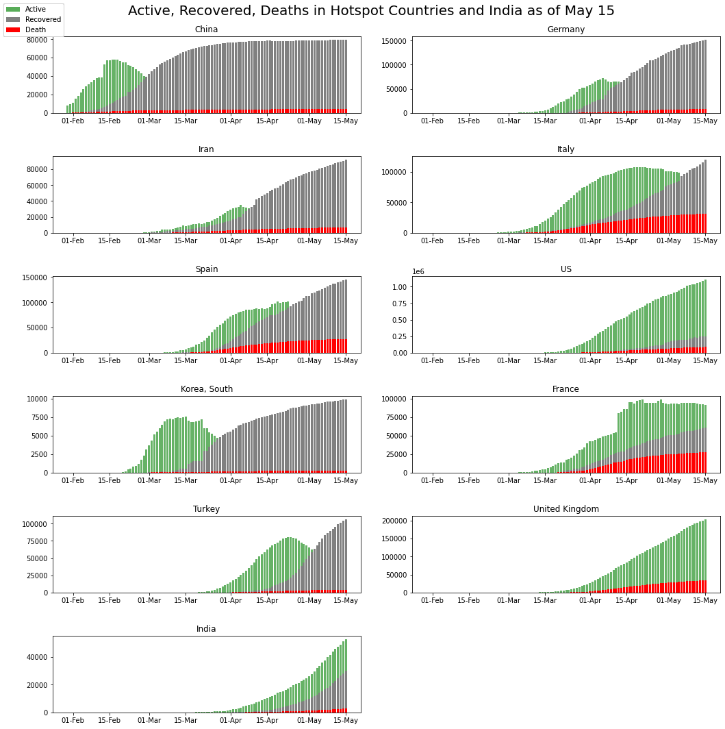
Can recover: South Korea, Germany, Iran (Flattened the Curve!).
Uncertainty in Recovery: Italy, France, Spain (Flattening!).
The United Kingdom is showing very fewer recoveries.
hotspots = ['China','Germany','Iran','Italy','Spain','United States','South Korea','France','Turkey','United Kingdom','India']
country_death_rate = pd.DataFrame(columns = ['country','day1','day2','day3'])
world_population['Population (2020)'] = world_population['Population (2020)']/1000000

d1=[]
d2 =[]
d3 = []
for country in hotspots:
    p = float(world_population[world_population['Country (or dependency)'] == country ]['Population (2020)'])
    if country == 'United States':
        k = global_deaths['US'][-3:]
    elif country == 'South Korea':
        k = global_deaths['Korea, South'][-3:]
    else:
        k = global_deaths[country][-3:]
    d1.append(round(k[0]/p,2))
    d2.append(round(k[1]/p,2))
    d3.append(round(k[2]/p,2))

country_death_rate['country'] = hotspots
country_death_rate['day1'] = d1
country_death_rate['day2'] = d2
country_death_rate['day3'] = d3

plt.figure(figsize= (10,10))
plt.hlines(y=country_death_rate['country'], xmin=country_death_rate['day1'], xmax=country_death_rate['day3'], color='grey', alpha=0.4);
plt.scatter(country_death_rate['day1'], country_death_rate['country'], color='skyblue', label='13th May');
plt.scatter(country_death_rate['day2'], country_death_rate['country'], color='green', label='14th May');
plt.scatter(country_death_rate['day3'], country_death_rate['country'], color='red', label='15th May');
plt.legend();
plt.title("Death Rate per Million in Hotspot Countries",fontsize=20);
plt.xlabel('Death Rate per Million');
labels = list(age_details['AgeGroup'])
sizes = list(age_details['TotalCases'])

explode = []

for i in labels:
    explode.append(0.05)

plt.figure(figsize= (15,10))
plt.pie(sizes, labels=labels, autopct='%1.1f%%', startangle=9, explode =explode)
centre_circle = plt.Circle((0,0),0.70,fc='white')

fig = plt.gcf()
fig.gca().add_artist(centre_circle)
plt.title('India - Age Group wise Distribution',fontsize = 20)
plt.axis('equal')
plt.tight_layout()
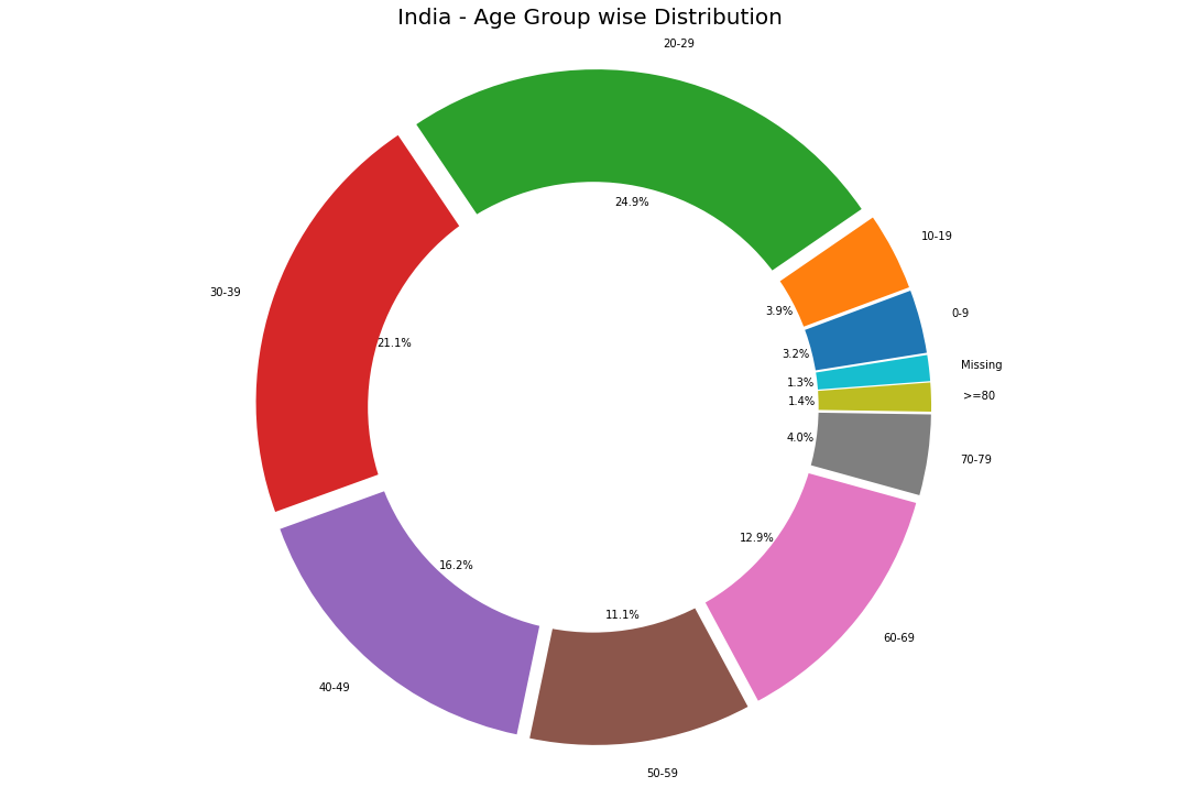
This pie chart reveals a quite interesting outcome. The age group affected the most is <40 years old, which is against the trend and news that says the elderly are more prone to the virus. Only 17% of the elderly ( 60+) are affected.
labels = ['Missing', 'Male', 'Female']
sizes = []
sizes.append(individual_details['gender'].isnull().sum())
sizes.append(list(individual_details['gender'].value_counts())[0])
sizes.append(list(individual_details['gender'].value_counts())[1])

explode = (0, 0.1, 0)
colors = ['#ffcc99','#66b3ff','#ff9999']

plt.figure(figsize= (15,10))
plt.title('Percentage of Gender',fontsize = 20)
plt.pie(sizes, explode=explode, labels=labels, colors=colors, autopct='%1.1f%%',shadow=True, startangle=90)
plt.axis('equal')
plt.tight_layout()
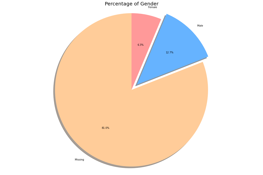
As we can see most of the percentage(~80%) of patient’s gender data is missing. Let us work with the remaining data.
labels = ['Male', 'Female']
sizes = []
sizes.append(list(individual_details['gender'].value_counts())[0])
sizes.append(list(individual_details['gender'].value_counts())[1])

explode = (0.1, 0)
colors = ['#66b3ff','#ff9999']

plt.figure(figsize= (15,10))
plt.pie(sizes, explode=explode, labels=labels, colors=colors, autopct='%1.1f%%',
        shadow=True, startangle=90)

plt.title('Percentage of Gender (Ignoring the Missing Values)',fontsize = 20)
plt.axis('equal')
plt.tight_layout()
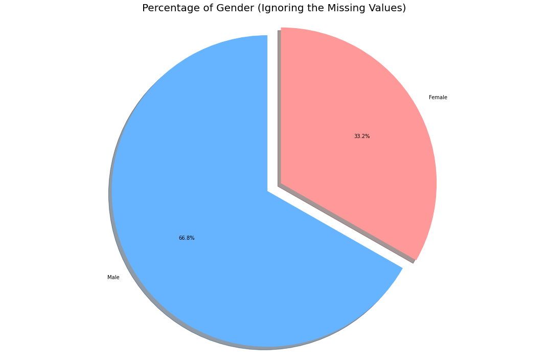
Thus from the remaining data, the only inference we could draw is that men were the most affected demographic (Note ~80% of data is missing, this might not be the real scenario).
dates = list(confirmed_df.columns[4:])
dates = list(pd.to_datetime(dates))
dates_india = dates[8:]
df1 = confirmed_df.groupby('Country/Region').sum().reset_index()
df2 = deaths_df.groupby('Country/Region').sum().reset_index()
df3 = recovered_df.groupby('Country/Region').sum().reset_index()

k = df1[df1['Country/Region']=='India'].loc[:,'1/30/20':]
india_confirmed = k.values.tolist()[0]

k = df2[df2['Country/Region']=='India'].loc[:,'1/30/20':]
india_deaths = k.values.tolist()[0]

k = df3[df3['Country/Region']=='India'].loc[:,'1/30/20':]
india_recovered = k.values.tolist()[0]

plt.figure(figsize= (15,10))
plt.xticks(rotation = 90 ,fontsize = 11)
plt.yticks(fontsize = 10)
plt.xlabel("Dates",fontsize = 20)
plt.ylabel('Total cases',fontsize = 20)
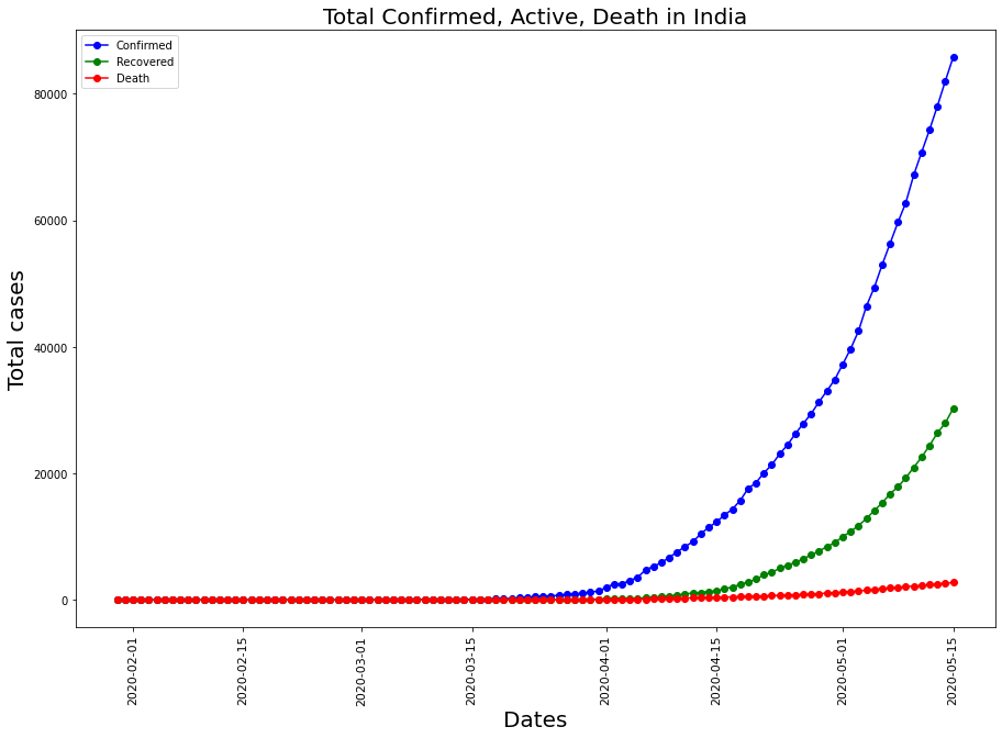
plt.title("Total Confirmed, Active, Death in India" , fontsize = 20)

ax1 = plt.plot_date(y= india_confirmed,x= dates_india,label = 'Confirmed',linestyle ='-',color = 'b')
ax2 = plt.plot_date(y= india_recovered,x= dates_india,label = 'Recovered',linestyle ='-',color = 'g')
ax3 = plt.plot_date(y= india_deaths,x= dates_india,label = 'Death',linestyle ='-',color = 'r')
plt.legend();
countries = ['China','US', 'Italy', 'Spain', 'France','India']

global_confirmed = []
global_recovered = []
global_deaths = []
global_active = []

for country in countries:
    k =df1[df1['Country/Region'] == country].loc[:,'1/30/20':]
    global_confirmed.append(k.values.tolist()[0])

    k =df2[df2['Country/Region'] == country].loc[:,'1/30/20':]
    global_deaths.append(k.values.tolist()[0])

    k =df3[df3['Country/Region'] == country].loc[:,'1/30/20':]
    global_deaths.append(k.values.tolist()[0])

plt.figure(figsize= (15,10))
plt.xticks(rotation = 90 ,fontsize = 11)
plt.yticks(fontsize = 10)
plt.xlabel("Dates",fontsize = 20)
plt.ylabel('Total cases',fontsize = 20)
plt.title("Comparison with other Countries" , fontsize = 20)

for i in range(len(countries)):
    plt.plot_date(y= global_confirmed[i],x= dates_india,label = countries[i],linestyle ='-')
plt.legend();
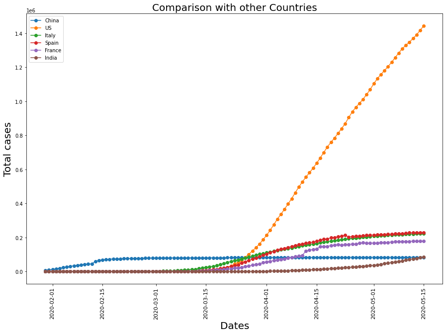
Though being more populated than all the other countries, the relative confirmed cases are lower in India. The reasons could be:
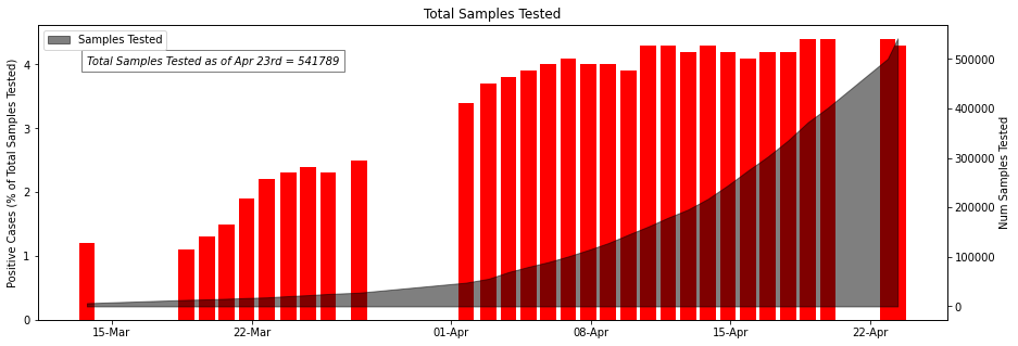
ICMR_details['Percent_positive'] = round((ICMR_details['TotalPositiveCases']/ICMR_details['TotalSamplesTested'])*100,1)

fig, ax1 = plt.subplots(figsize= (15,5))
ax1.xaxis.set_major_formatter(mdates.DateFormatter('%d-%b'))
ax1.set_ylabel('Positive Cases (% of Total Samples Tested)')
ax1.bar(ICMR_details['DateTime'] , ICMR_details['Percent_positive'], color="red",label = 'Percentage of Positive Cases')
ax1.text(ICMR_details['DateTime'][0],4, 'Total Samples Tested as of Apr 23rd = 541789', style='italic',fontsize= 10,
        bbox={'facecolor': 'white' ,'alpha': 0.5, 'pad': 5})

ax2 = ax1.twinx()
ax2.xaxis.set_major_formatter(mdates.DateFormatter('%d-%b'))
ax2.set_ylabel('Num Samples Tested')
ax2.fill_between(ICMR_details['DateTime'],ICMR_details['TotalSamplesTested'],color = 'black',alpha = 0.5,label = 'Samples Tested');

plt.legend(loc="upper left")
plt.title('Total Samples Tested')
plt.show()
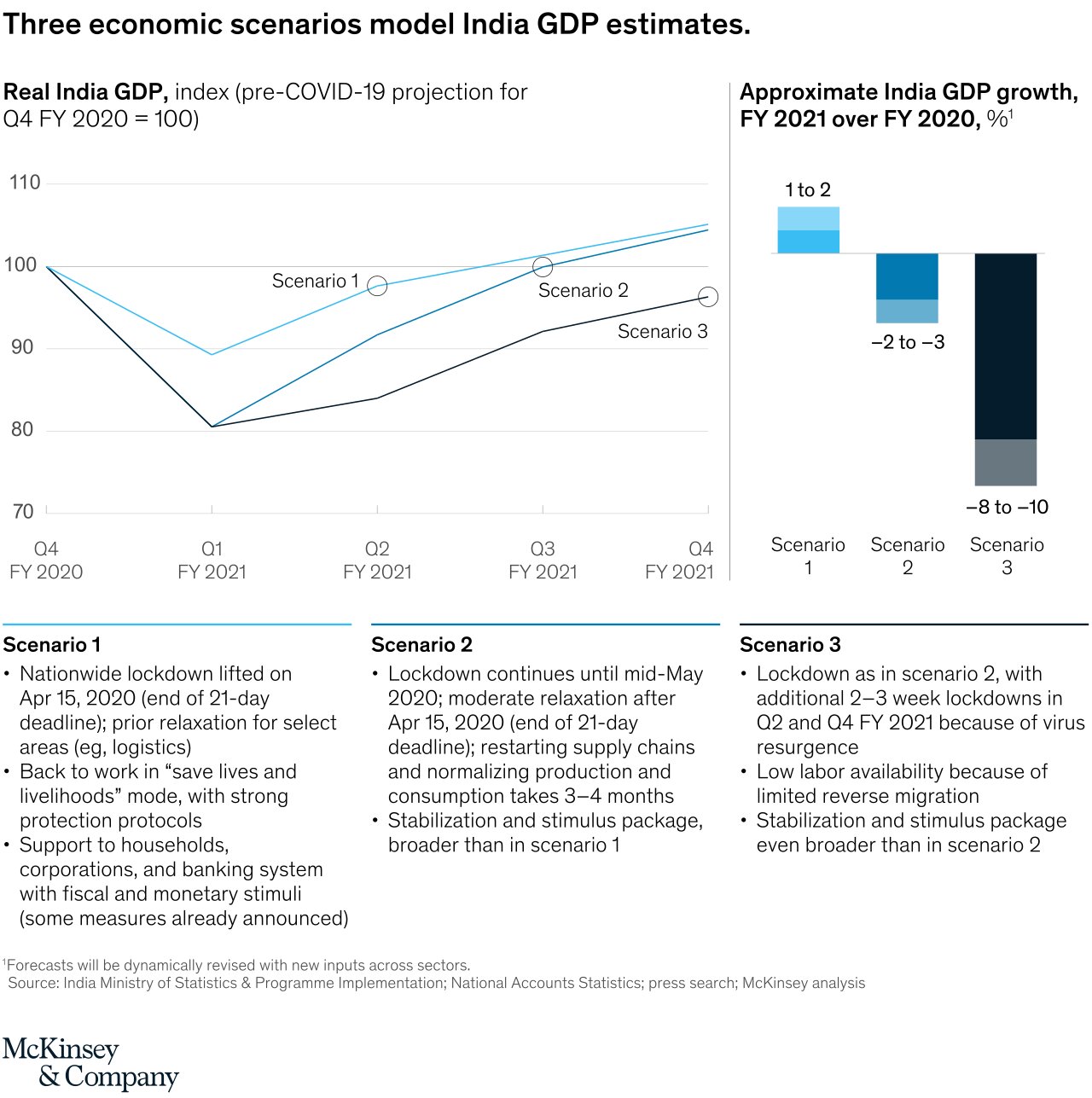
An interesting insight is drawn by McKinsey & Company. They actually predicted that Indian GDP was supposed to go up, but we all know how that went. This fact confirms that Data science is not always right, the future is uncertain.
As you all know, this pandemic has been filled with ups and downs for everybody(mostly downs). A good gesture, a smile when you see them can go a long way since you don’t know what the other person is going through.
This dataset was particularly interesting to work with, and if you wanna check out my other blog about Covid data, you can read it here:
Visualizing covid data with Plotly | Sion
And if you wanna check out more of my writings, and help me out, this is where you can read them:
Sion | Author at Analytics Vidhya
I hope you had a good time reading this article. Stay safe and Cheers!!!!!
The media shown in this article on Data Visualizations in Julia are not owned by Analytics Vidhya and is used at the Author’s discretion.
Lorem ipsum dolor sit amet, consectetur adipiscing elit,