This article was published as a part of the Data Science Blogathon.
The graphical or pictorial representation of data and information is called Data Visualization. Using different tools like graphs, charts, maps, etc, data visualization tools provide a very effective and efficient way of finding trends, outliers, and patterns in data, which might seem nonexistent to human eyes.
Data visualization tools and technologies are highly essential in the world of Big Data, to access and analyze massive amounts of information and make data-driven decisions.
Some of the benefits and advantages of data visualization are:
Human eyes are drawn to colors and patterns. We can quickly identify yellow from green, circle from a square. the human culture is visual itself, starting from Arts and crafts, to advertisements, Tv, and movies.
Data visualization can be described as another form of art, that grabs our eyes and attention, and keeps us focused on the underlying message. While viewing a chart we can easily and quickly see upcoming or ongoing trends, outliers, etc. And this visual representation helps us digest the facts faster.
You know how much more effective data visualization can be if you’ve ever stared at a massive excel sheet, and couldn’t make out the head or tail of it.
Today we will do Data Visualization of covid datasets across the world. This dataset can be found on Kaggle, linked here.

We will use Plotly for this. It is an open-source graphical library for Python, which produces interactive, publication-quality graphs. Its headquarters are located in Montreal, Quebec, which develops online data analytics and visualization tools.
They provide online graph creation, analytics, and statistical tools for individuals as well as corporations, along with scientific graphing libraries for Python, R, MATLAB, Perl, Julia, Arduino, and REST.

First, we install the chart-studio, for interfacing with Plotly’s Chart Studio services( Both Chart Studio cloud and Chart Studio On-Perm).
!pip install chart_studio
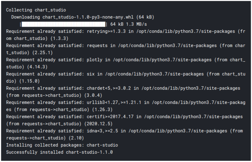
Next, we import the necessary modules and libraries:
import pandas as pd
import numpy as np
import chart_studio.plotly as py
import cufflinks as cf
import seaborn as sns
import plotly.express as px
%matplotlib inline

# Make Plotly work in your Jupyter Notebook
from plotly.offline import download_plotlyjs, init_notebook_mode, plot, iplot
init_notebook_mode(connected=True)
# Use Plotly locally
cf.go_offline()
Let’s take a look at the dataset first:
country_wise = pd.read_csv('/kaggle/input/corona-virus-report/country_wise_latest.csv')
print("Country Wise Data shape =",country_wise.shape)
country_wise.head()


The last column is named “WHO Region“. Due to some technical glitches, it was not visible in the screenshot.
country_wise.info()
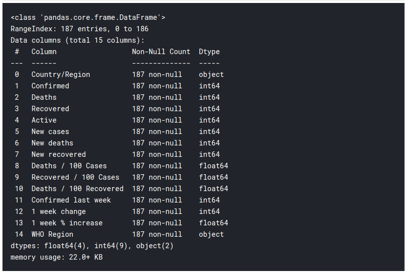
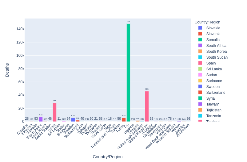
Let us visualize total deaths from all the countries. Due to a large number of countries, I have divided them into different plots.
import plotly.graph_objects as go


# Display death due to covid data for various countries
fig = px.bar(country_wise.head(50), y='Deaths', x='Country/Region', text='Deaths', color='Country/Region')
# Put bar total value above bars with 2 values of precision
fig.update_traces(texttemplate='%{text:.2s}', textposition='outside')
# Set fontsize and uniformtext_mode='hide' says to hide the text if it won't fit
fig.update_layout(uniformtext_minsize=8)
# Rotate labels 45 degrees
fig.update_layout(xaxis_tickangle=-45)
fig
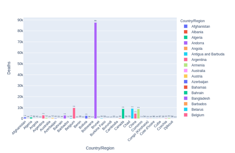
fig1 = px.bar(country_wise[50:101], y='Deaths', x='Country/Region', text='Deaths', color='Country/Region')
# Put bar total value above bars with 2 values of precision
fig1.update_traces(texttemplate='%{text:.2s}', textposition='outside')
# Set fontsize and uniformtext_mode='hide' says to hide the text if it won't fit
fig1.update_layout(uniformtext_minsize=8)
# Rotate labels 45 degrees
fig1.update_layout(xaxis_tickangle=-45)
fig1
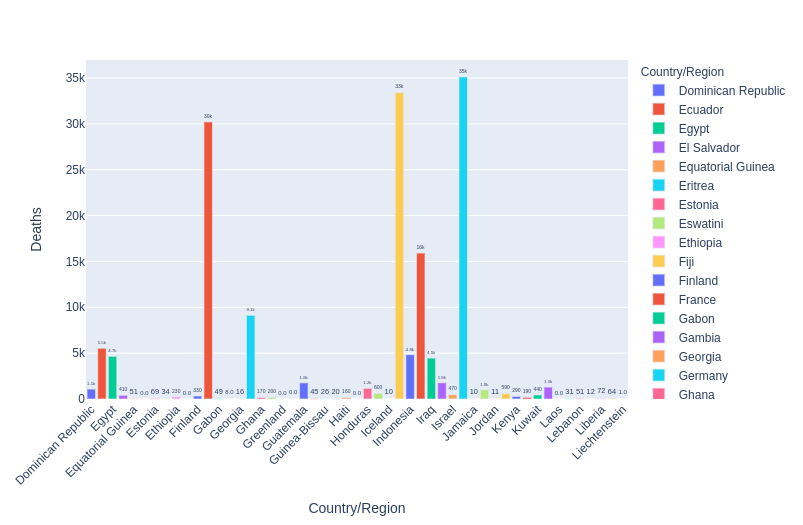
fig1 = px.bar(country_wise[101:151], y='Deaths', x='Country/Region', text='Deaths', color='Country/Region')
# Put bar total value above bars with 2 values of precision
fig1.update_traces(texttemplate='%{text:.2s}', textposition='outside')
# Set fontsize and uniformtext_mode='hide' says to hide the text if it won't fit
fig1.update_layout(uniformtext_minsize=8)
# Rotate labels 45 degrees
fig1.update_layout(xaxis_tickangle=-45)
fig1
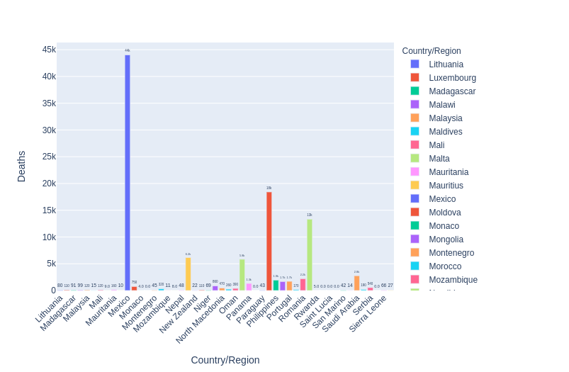
fig1 = px.bar(country_wise[151:], y='Deaths', x='Country/Region', text='Deaths', color='Country/Region')
# Put bar total value above bars with 2 values of precision
fig1.update_traces(texttemplate='%{text:.2s}', textposition='outside')
# Set fontsize and uniformtext_mode='hide' says to hide the text if it won't fit
fig1.update_layout(uniformtext_minsize=8)
# Rotate labels 45 degrees
fig1.update_layout(xaxis_tickangle=-45)
fig1
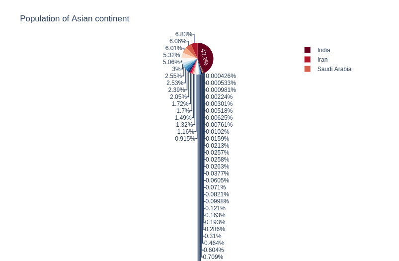
worldometer = pd.read_csv('/kaggle/input/corona-virus-report/worldometer_data.csv')
worldometer_asia = worldometer[worldometer['Continent'] == 'Asia']


px.pie(worldometer_asia, values='TotalCases', names='Country/Region',
       title='Population of Asian continent',
       color_discrete_sequence=px.colors.sequential.RdBu)
Note: The animation could not be added to this article, but if you write the code and run it, it will play seamlessly.
full_grouped = pd.read_csv('/kaggle/input/corona-virus-report/full_grouped.csv')

india = full_grouped[full_grouped['Country/Region'] == 'India']
us = full_grouped[full_grouped['Country/Region'] == 'US']
russia = full_grouped[full_grouped['Country/Region'] == 'Russia']
china = full_grouped[full_grouped['Country/Region'] == 'China']
df = pd.concat([india,us,russia,china], axis=0)

# Watch as bars chart covid cases changes


fig = px.bar(df, x="Country/Region", y="Confirmed", color="Country/Region",
  animation_frame="Date", animation_group="Country/Region", range_y=[0,df['Confirmed'].max() + 100000])

fig.layout.updatemenus[0].buttons[0].args[1]["frame"]["duration"] = 1

fig
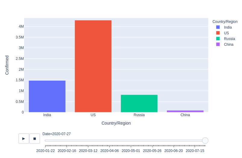
The end result of the animation
Now we plot a histogram for deaths across all the Asian Countries.
# bins represent the number of bars to make
# Can define x label, color, title
# marginal creates another plot (violin, box, rug)

fig = px.histogram(worldometer_asia,x = 'TotalDeaths', nbins=20,
                   labels={'value':'Total Deaths'},title='Death Distribution of Asia Continent',
                   marginal='violin',
                   color='Country/Region')

fig.update_layout(
    xaxis_title_text='Total Deaths', showlegend=True
)
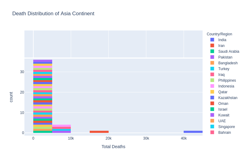
So as you can see, India had the most number of deaths, around 40-45k, which is really sad.
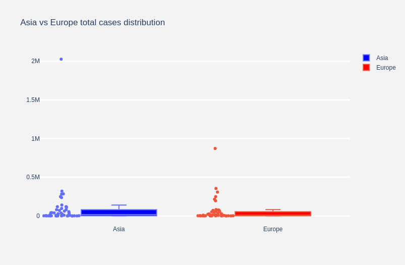
# A box plot allows you to compare different variables
# The box shows the quartiles of the data. The bar in the middle is the median
# The whiskers extend to all the other data aside from the points that are considered
# to be outliers

# Complex Styling
fig = go.Figure()
# Show all points, spread them so they don't overlap and change whisker width
fig.add_trace(go.Box(y=worldometer_asia['TotalCases'], boxpoints='all', name='Asia',
                    fillcolor='blue', jitter=0.5, whiskerwidth=0.2))
fig.add_trace(go.Box(y=worldometer[worldometer['Continent'] == 'Europe']['TotalCases'], boxpoints='all', name='Europe',
                    fillcolor='red', jitter=0.5, whiskerwidth=0.2))
# Change background / grid colors
fig.update_layout(title='Asia vs Europe total cases distribution',
                  yaxis=dict(gridcolor='rgb(255, 255, 255)',
                 gridwidth=3),
                 paper_bgcolor='rgb(243, 243, 243)',
                 plot_bgcolor='rgb(243, 243, 243)')
This is one of my favourite features from Plotly and another module called Pycountry. We can create an interactive Global Map, which displays all the deaths due to the Coronavirus, in different regions. I highly urge you to run this code and see how this map works.
import pycountry

worldometer['Country/Region'].replace('USA','United States', inplace=True)
worldometer['Country/Region'].replace('UAE','United Arab Emirates', inplace=True)
worldometer['Country/Region'].replace('Ivory Coast','Côte d'Ivoire', inplace=True)
worldometer['Country/Region'].replace('S. Korea','Korea', inplace=True)
worldometer['Country/Region'].replace('N. Korea','Korea', inplace=True)
worldometer['Country/Region'].replace('DRC','Republic of the Congo', inplace=True)
worldometer['Country/Region'].replace('Channel Islands','Jersey', inplace=True)

exceptions = []

def get_alpha_3_code(cou):
    try:
        return pycountry.countries.search_fuzzy(cou)[0].alpha_3
    except:
        exceptions.append(cou)


worldometer['iso_alpha'] = worldometer['Country/Region'].apply(lambda x : get_alpha_3_code(x))

# removeing exceptions
for exc in exceptions:
    worldometer = worldometer[worldometer['Country/Region']!=exc]


fig = px.scatter_geo(worldometer, locations="iso_alpha",
                     color="Continent", # which column to use to set the color of markers
                     hover_name="Country/Region", # column added to hover information
                     size="TotalCases", # size of markers
                     projection="orthographic")
fig
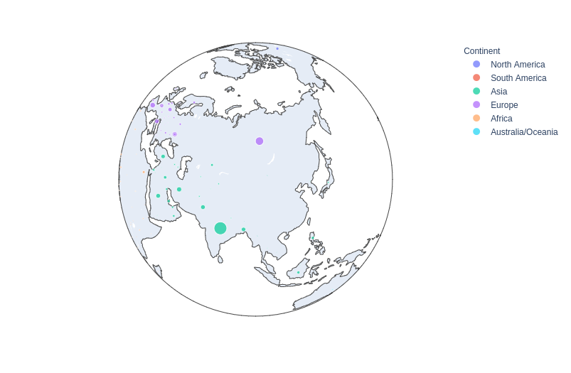
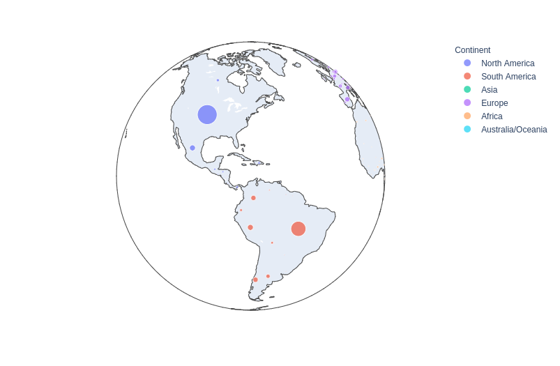
You can rotate the globe using your cursor and view all the deaths in every country. A very tidy and neat visualization in my opinion.
Plotly is one of my favorite goto libraries for visualization, apart from Matplotlib or Seaborn. I would like to write a blog about it someday as well. If you like what you see and want to check out more of my writings, you can do so here:
Sion | Author at Analytics Vidhya
I hope you had a good time reading this article. Thank you for reading, Cheers!!
The media shown in this article on visualizing covid data in plotly are not owned by Analytics Vidhya and is used at the Author’s discretion.
Lorem ipsum dolor sit amet, consectetur adipiscing elit,